Typography Story I: Domineering from the era of ancient Rome and Gutenberg

Over the weekend, I finished reading Fonto No Fushigi (フォントのふしぎ, The Unthinkable Typeface) by the Japanese font designer Akira Kobayashi.

In the book, I found a lot of historical stories and design anecdotes behind the fonts in daily life but I failed to pay attention to. I was also very touched by his ingenuity as a type designer, so I sorted out the core content in the book and share them with readers. (You may also read this article in Simplified Chinese.)
About Akira Kobayashi
Akira Kobayashi (小林 章) is often referred to as the №1 Western-typeface designer in Japan. Although he did not introduce his life in detail in The Unthinkable Typeface, I can still sneak peek his devotion and persistence behind becoming the “№1”.
Akira Kobayashi graduated from the Department of Visual Arts Communication at Takezano Art University, Japan. In 1983, he photo-typed fonts in a design company. Feeling that he lacked knowledge of Western fonts, he resigned resolutely and moved to the UK in 1989. For one and a half years, he devoted himself to learning Western calligraphy and typography.
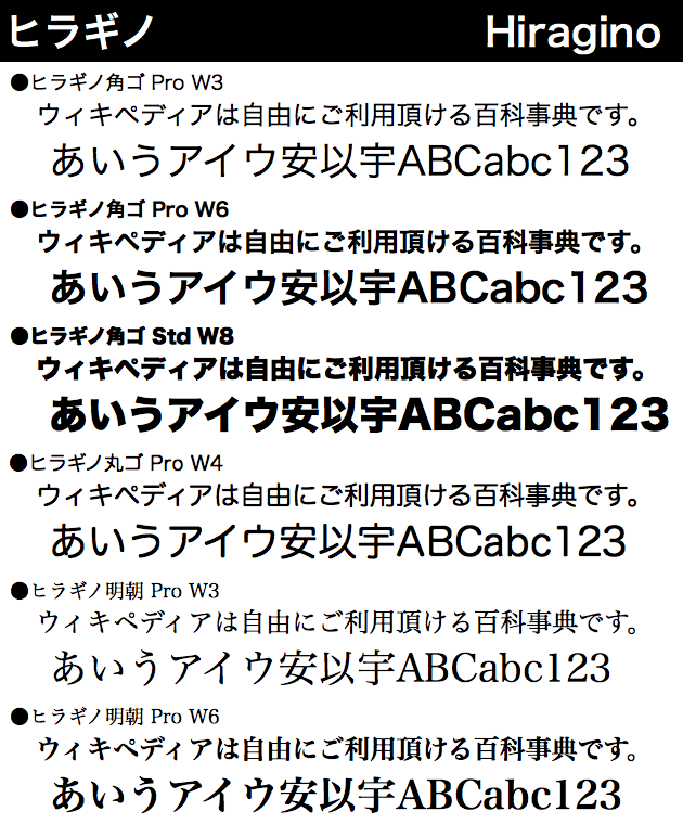
After Kobayashi returned to Japan in 1990, he worked in Japan’s acclaimed font development and production company JIYUKOBO Ltd. During the period, he participated in the design and digitalization of two famous Japanese typeface series Hiragino, including Hiragino Mincho (Serif) and Hiragino Kaku Gothic (Sans-Serif). These two fonts are still embedded in the Mac OS system and widely used.
From 1993 to 1997, Akira Kobayashi worked on the design of the Western character set of Japanese types in TypeBank. Later, he became a freelance designer and published several western fonts. He won many awards in international font competitions and had since then gained a reputation in the font design world.
In the spring of 2001, he joined Monotype in Germany as the font design director. He is in charge of the production supervision and quality control of font design, and proposals of new fonts. Akira Kobayashi also worked with masters such as Hermann Zapf and Adrian Frutiger. Together they embarked on the improvement of various font masterpieces.
In recent years, Akira Kobayashi has led Monotype’s projects to design customized Western fonts for Sony and Tencent. In Alibaba’s latest released typeface Alibaba Sans, Akira Kobayashi himself is the designer of the Western character set.
In the book, Akira Kobayashi mentioned that in order to dig out the reasons behind a mistake in the use of a printed matter in the 19th-century, he once wrote to a friend afar in the UK for clarification. He also had experience visiting collaborators in a distant city with a laptop to correct the details of the font design. Kobayashi wrote that when he just joined Monotype, he was not fluent in English nor knew nothing about German; but these barriers did not stop him from upgrading to become a font expert of the Western font (including German).
So let’s take a look at the charm of the Western font in the eyes of Akira Kobayashi.
Where does the domineering sense come from
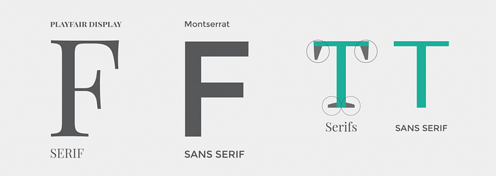
Serif vs Sans Serif Fonts
Serif is a decorative line at the end of a stroke in a letter. In 1968, Father Edward Catich mentioned in his book The Origin of the Serif that before the Roman alphabet was first engraved on a stone tablet, it had to be written with a square-tip brush and then carved in the same way. Since writing directly with a square-tip brush will cause roughness at the beginning and end of the strokes, the craftsmen add finishing strokes at the beginning, end, and corners of the strokes, which naturally form Serifs.
The font opposite to the serif font is the sans serif font, Sans Serif.
In the world of CJK fonts (fonts which contain a large range of Chinese/Japanese/Korean characters), Ming and Gothic are two typical serif and sans serif fonts.
Whether in Eastern or Western history, the origin of serif can be further dated than that of sans serif. In the early digital era, when screen resolutions were low, sans serifs were favoured for their display effects; but in printed matter, serifs still have an unshakable position.
Trajan: Classical Domineering Sense
Trajan font is to commemorate the font on the triumphal column set up by the ancient Roman emperor Trajan, and it is also the oldest origin of Western serif fonts.
Trajan has a tough outline, delicate serifs and special classical proportions (such as: N and O are very wide and close to a square, but S and E are very narrow).
Trajan is embedded in Mac OS, so it can be widely used. Because of the ancient and domineering sense, Trajan can be easily found on book covers and movie posters — once you noticed that, you will find Trajan is ubiquitous. I came across a fun shot Kirby Ferguson sharing complains about this:
Futura: The Modern Luxury
Futura is a sans serif font and also the Logo font used by Louis Vuitton. If you look carefully, you will find that LV has deliberately increased the character spacing, and suddenly has an awe-inspiring sense of distance.
Futura is also embedded in Mac OS, so it can be widely used.
Case Study: Create modernity from classics
The Belgian chocolate brand GODIVA once used Trajan as the brand font. Today, it removes the serifs from the Trajan letters, creating a moderately modern feel.
The Gorgeousness from Copperplate Printing
Copperplate printing has become popular since the 18th century (Rococo era). The fonts with both contemporary style and domineering sense can be generalized in three types:
Type 1: Gothic font with capital letters that look square and flat horizontally
For example, Copperplate Gothic and Sackers Gothic with the serif cut off can bring up a sense of the times when copperplate printing was a trend.
Type 2: Printing letters with thick vertical lines and fine horizontal lines
In the era of copper printing, this type of font is not so much a design but rather a product that is easier to engrave. These fonts include Nicolas Cochin (used in Dior’s Logo), Didot (used in VOGUE Magazine) and Bondini.
Type 3: Copperplate Script with a slender cursive sloping sharply to the right
The western swashes that we often see.
In addition, the fonts used by Cartier, Chopard and RALPH LAUREN’s Black Label are also in copperplate script style.
Resources
The Unthinkable Typeface (フォントのふしぎ), by Akira Kobayashi
